Formula 1 liveries are often judged as design exercises, but in reality they function as positioning statements. In the first season of a new technical era, colour, contrast and restraint reveal how teams see themselves and how they want to be seen. The 2026 grid is less about reinvention, and more about signalling intent.
From Brand to Belief: What the 2026 Liveries Reveal
With the reset of regulations looming, liveries in 2026 function less as seasonal refreshes and more as declarations of belief. Some teams lean into heritage and continuity. Others strip their designs back to a race-first minimalism, while a few attempt to balance brand expansion with competitive credibility. Taken together, the grid offers an early snapshot of where each project believes its foundations truly lie before performance has a chance to confirm or contradict that vision.
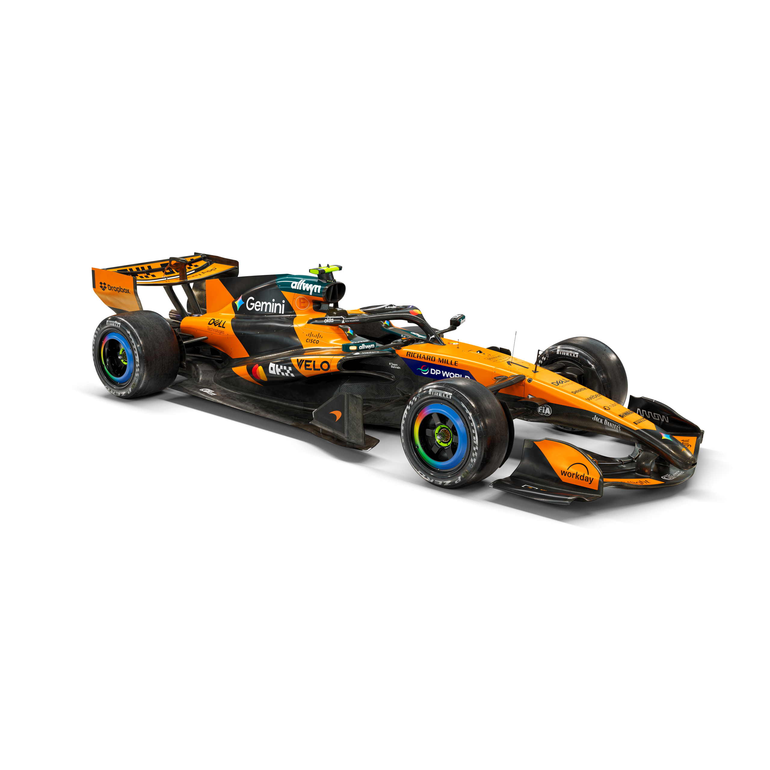
McLaren Mastercard F1 Team
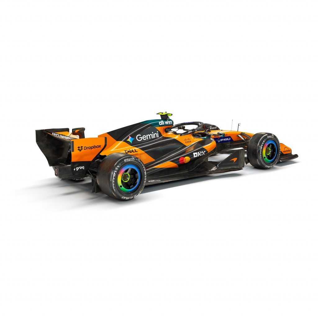
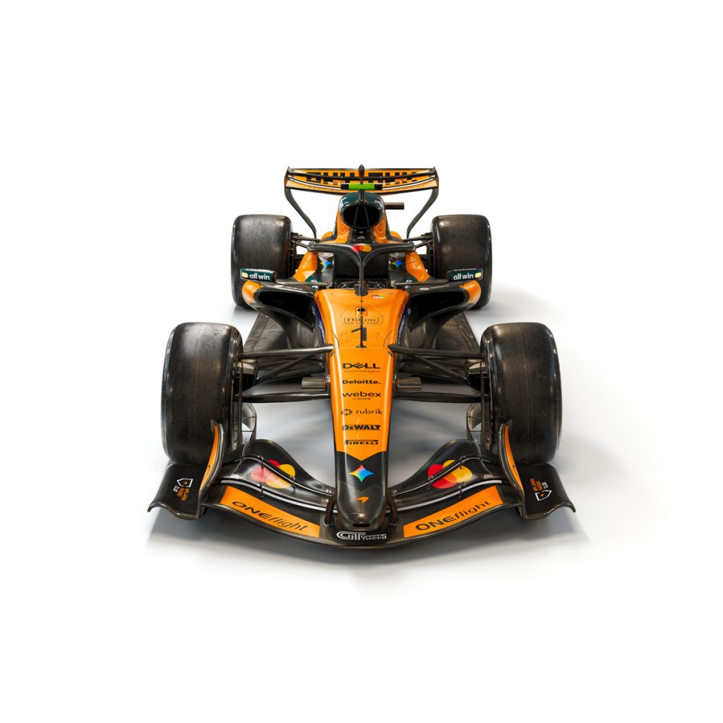
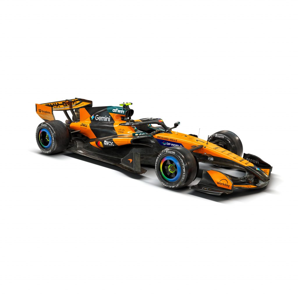
New McLaren Mastercard livery for the 2026 F1 season. – Photo Credit: McLaren
McLaren treats 2026 as brand consolidation, not reinvention. The team keeps its papaya core and uses small refinements to say one thing: momentum continues. That choice also aligns with McLaren’s current positioning as a modern, sponsor led giant that sells energy, youth, and speed in one clean package.
CEO Zak Brown stated, “We don’t want to change what’s been successful, reinforcing the choice to preserve a proven visual formula.”
The biggest headline sits above the paint. McLaren shifts to the name McLaren Mastercard Formula 1 Team, which turns the partnership into a structural identity pillar rather than a decal. The move extends beyond 2026 and frames Mastercard as a long range anchor in McLaren’s commercial story.
Mercedes-AMG PETRONAS Formula One Team
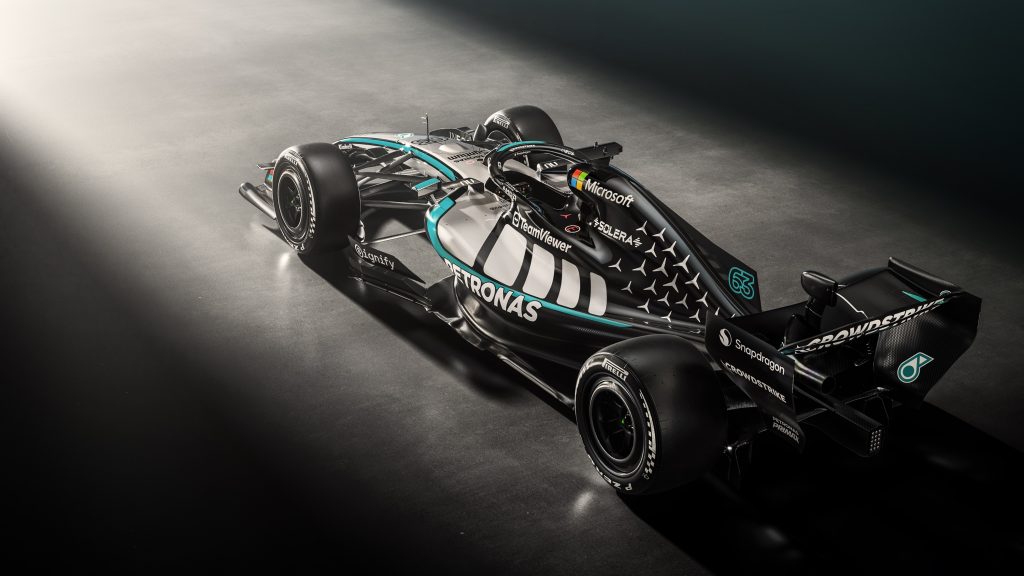
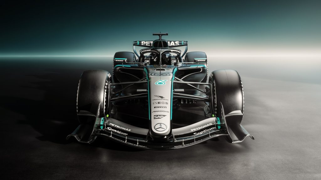
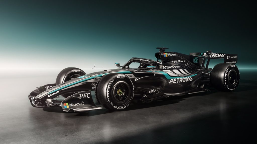
New Mercedes-AMG PETRONAS livery for the 2026 F1 season. – Photo Credit: Mercedes AMG Petronas F1 Team
Mercedes approaches 2026 like a brand that trusts its own architecture. It does not chase novelty. It sharpens intent. The car continues to project a technical, purposeful identity, with PETRONAS green acting as the visual thread that links motion to precision.
The livery’s strength comes from structure. Mercedes uses high contrast surfaces as a grid for its partner ecosystem, and it lets PETRONAS, INEOS, and the broader sponsor stack sit inside that system without turning the car into clutter. That discipline reads as confidence, even if the shapes themselves stay familiar.
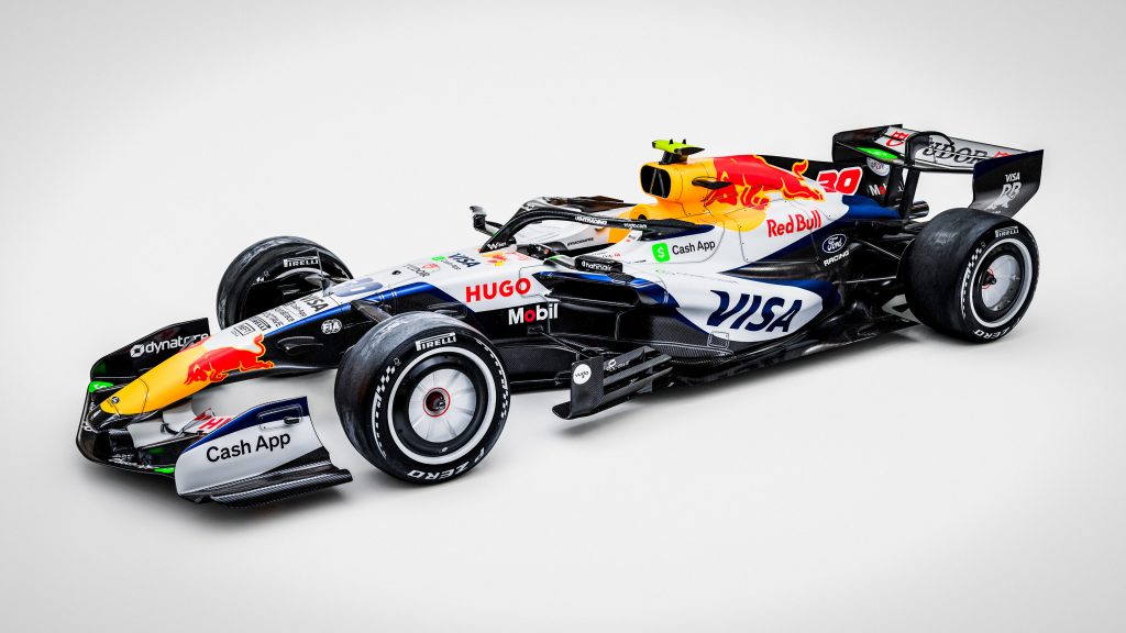
Oracle Red Bull Racing
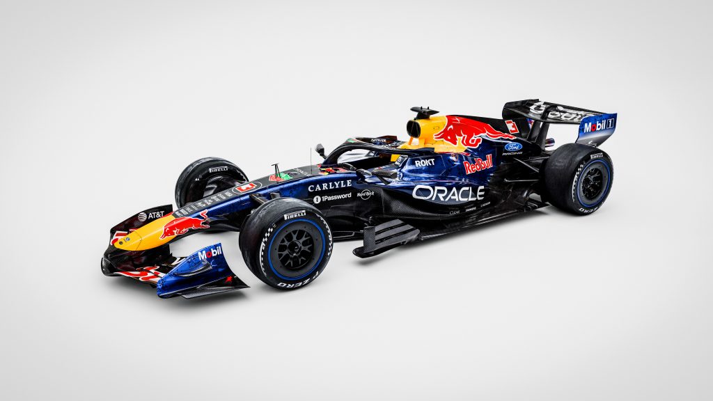
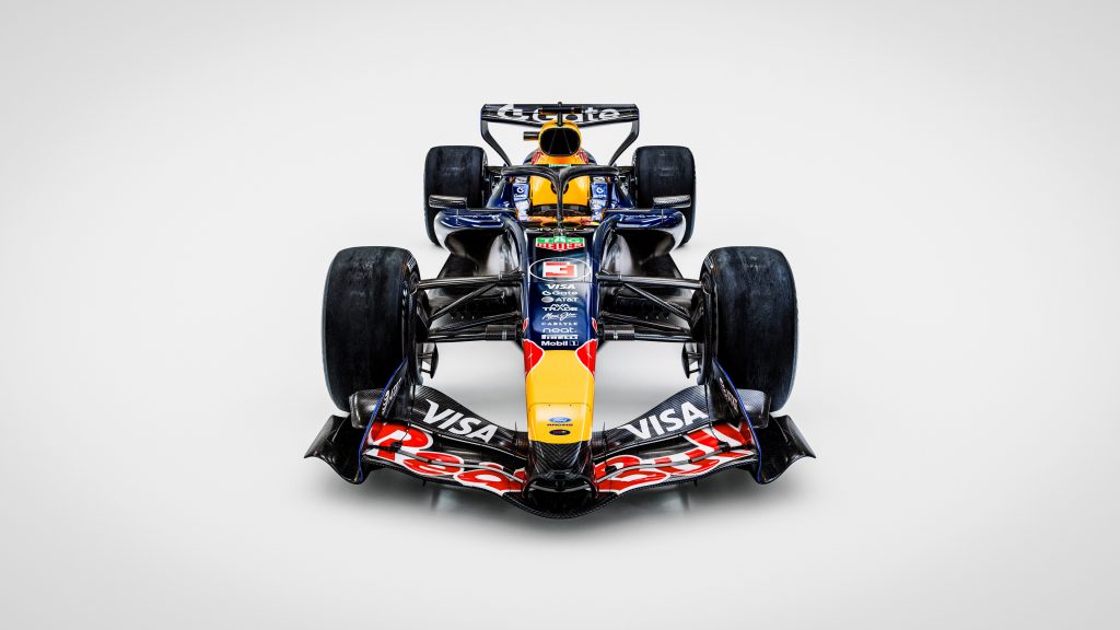
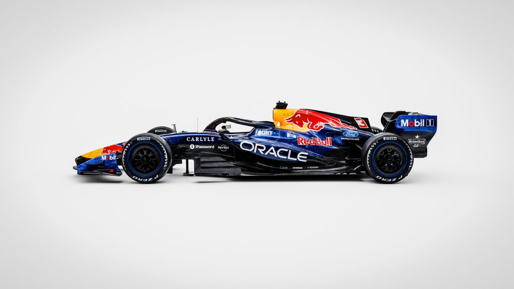
New livery on the Oracle Red Bull Racing car for the 2026 Formula 1 Season – Red Bull Content Pool
Red Bull sells continuity, then adds a single new headline. The familiar deep blue and yellow identity remains the dominant signal, while partner placement does the storytelling work around the margins. That approach fits Red Bull’s habit of treating the livery as a stable platform for a shifting competitive and technical narrative.
The key new note comes from the Ford relationship. Coverage points to Ford branding gaining prominence on the 2026 car, and that placement matters because it visually frames the start of a new power unit chapter without forcing a full aesthetic reboot.
Scuderia Ferrari HP
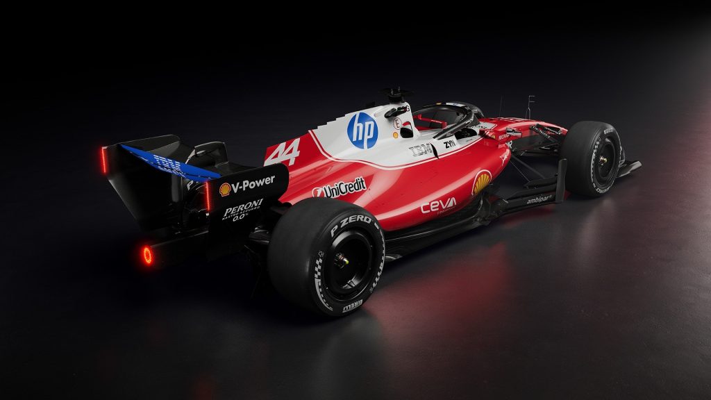
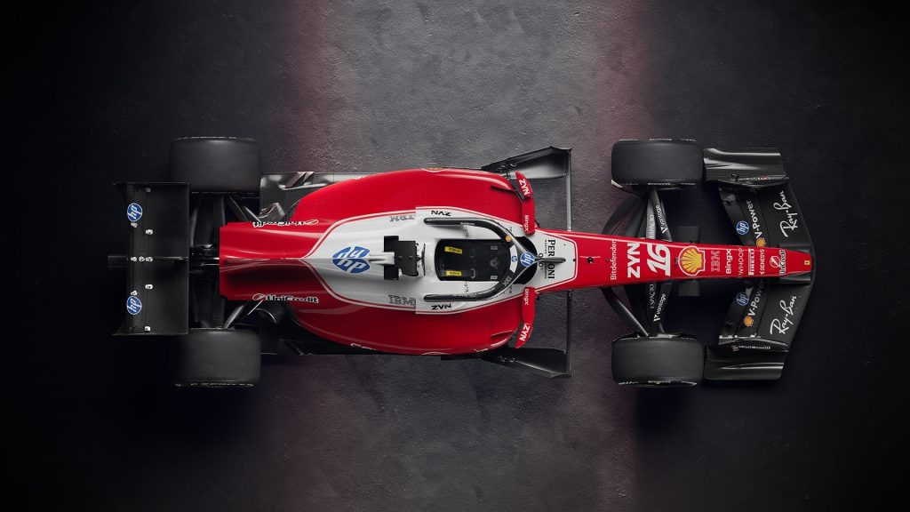
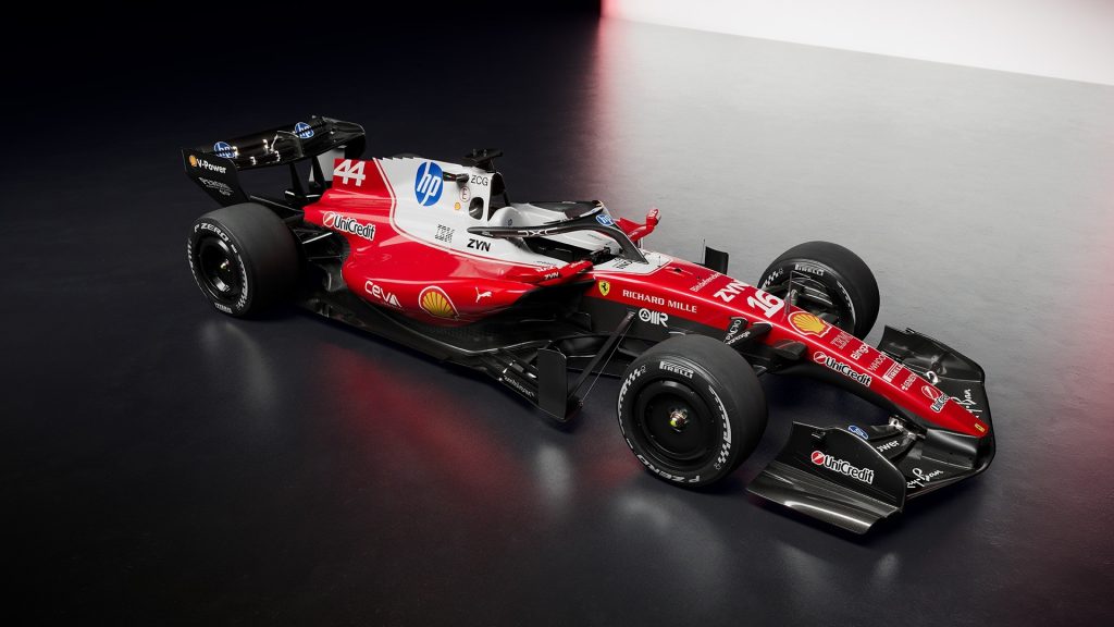
New Scuderia Ferrari livery for the 2026 F1 season. – Photo Credit: Scuderia Ferrari
Ferrari leans into clarity and contrast. The design places Ferrari red back at the centre, then uses expanded white zones to frame key surfaces and make sponsor integration feel less forced. The HP relationship matters here, because the livery must absorb a modern tech brand without diluting Ferrari’s visual heritage.
Ferrari’s best liveries do two things at once. They look unmistakably Ferrari at speed, and they create clean sponsor homes that prevent the car from reading like a collage. The 2026 approach follows that logic, with white working as both a recognition tool and a sponsor alignment tool.
Visa Cash App Racing Bulls Formula One Team
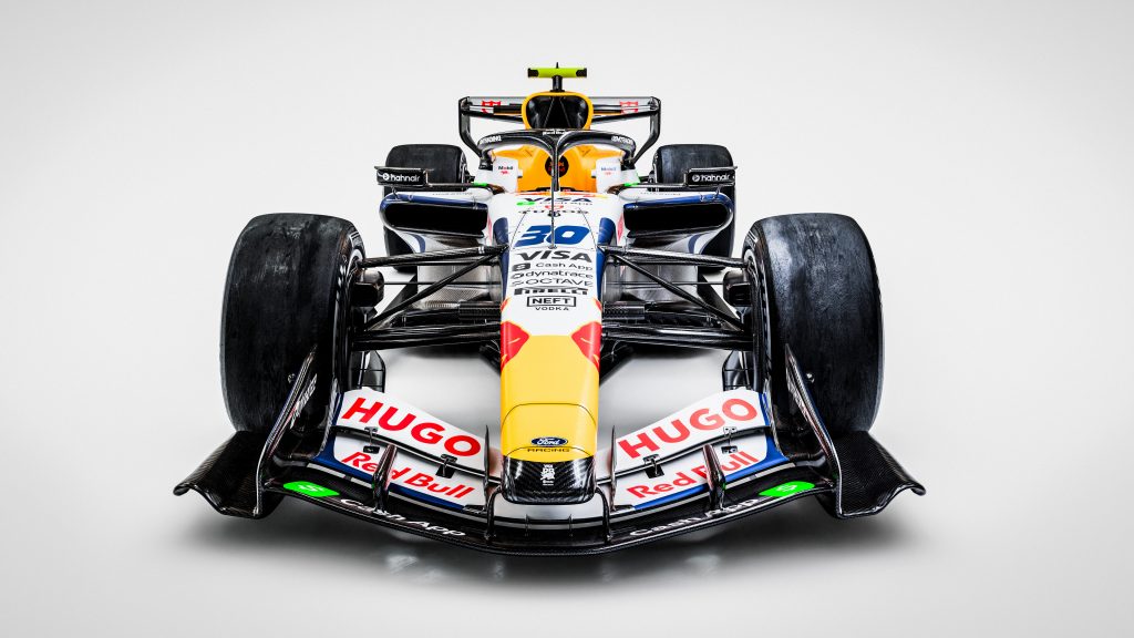
Visa Cash App Racing Bulls livery for the 2026 F1 season. – Red Bull Content Pool
Racing Bulls continues to live in a branding paradox. The livery wants a clean white identity, but the sponsor ecosystem pushes density. That tension shows up in the way the car reads from distance versus up close. From far away you get instant recognition. From near, you get a negotiation between logos.
Coverage also links Ford’s growing presence in the Red Bull technology and power unit narrative to evolving colour accents across the wider Red Bull family. The result lands as cohesive strategy, but the car still struggles to look calm when the sponsor stack grows.
TGR Haas F1 Team
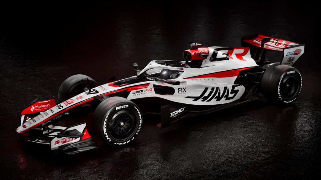
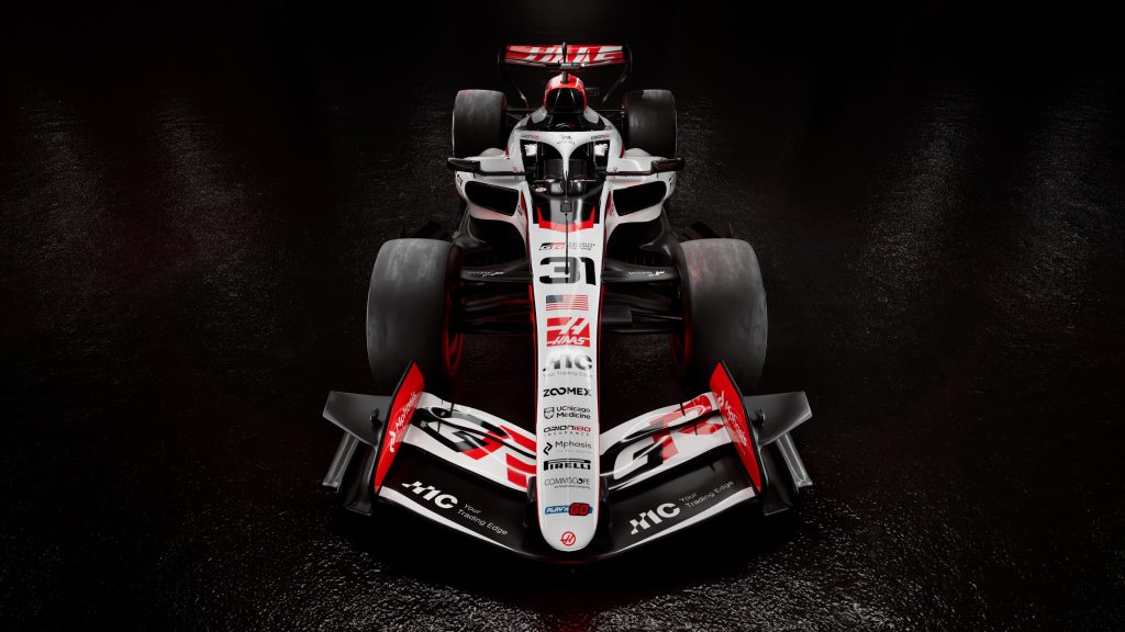
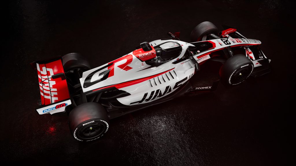
New TGR Haas livery for the 2026 F1 season. – Photo Credit: Haas F1 Team
Haas uses 2026 to reframe itself through partnership. Reporting connects Toyota Gazoo Racing to Haas in a title level role, and that sort of relationship inevitably reshapes visual hierarchy. When a major manufacturer enters the frame, the livery stops acting like a small team’s billboard and starts acting like an industrial statement.
The Haas identity still leans on high contrast, exposed carbon, and sharp red touches, but Toyota’s presence changes what those choices communicate. The car no longer sells “pragmatic survival.” It sells backing, structure, and a longer horizon.
Audi Revolut F1 Team
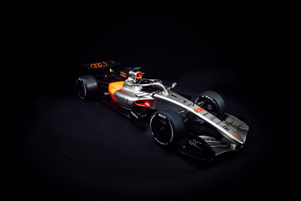
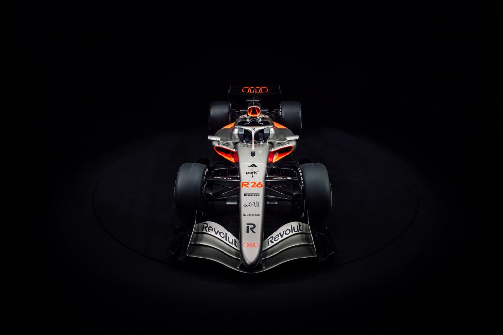
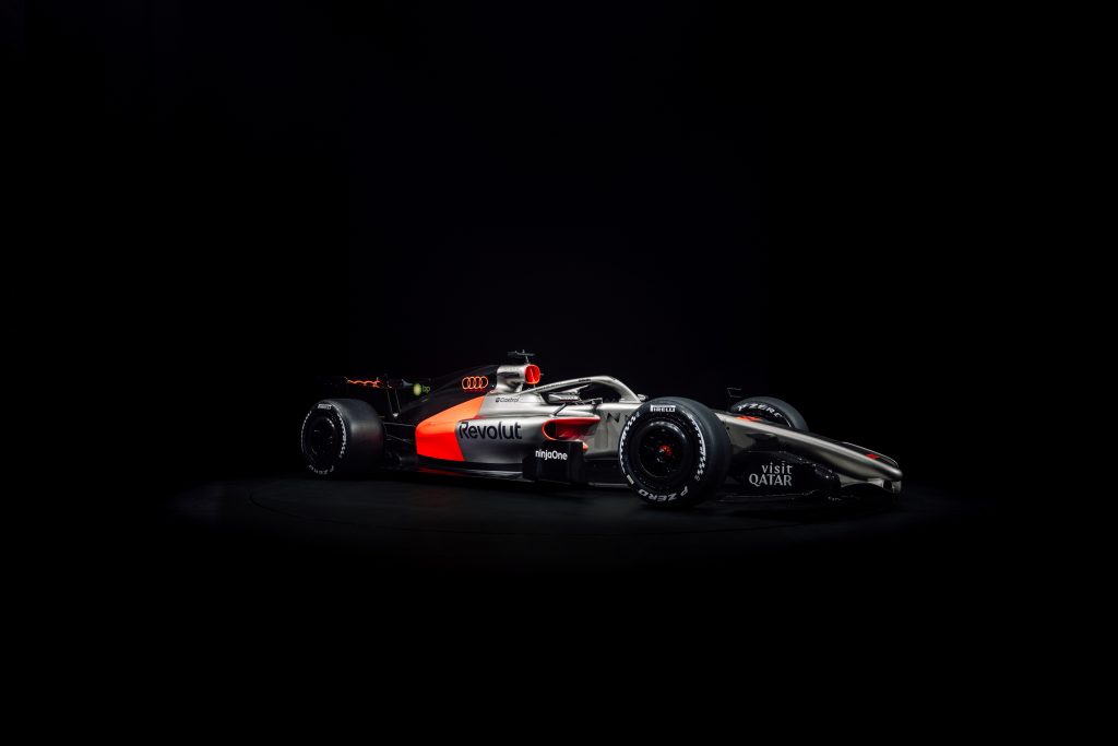
New Audi Revolut livery for the 2026 F1 season. – Image Credit: AUDI AG
Audi enters the grid with a controlled, premium posture. Reporting ties Revolut to Audi’s naming and branding strategy, and the livery matches that corporate tone with a clean base, deliberate contrast, and carefully rationed highlight colour.
The danger for Audi sits in emotional temperature. The design reads as disciplined, but it risks looking like a concept car that never fully commits to racing aggression. That may suit a brand that values restraint, yet Formula 1 debuts often demand a sharper statement of arrival.
BWT Alpine Formula One Team
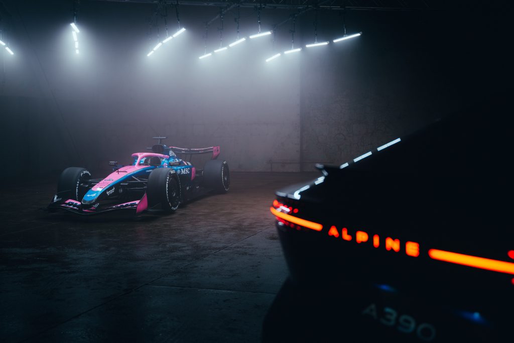
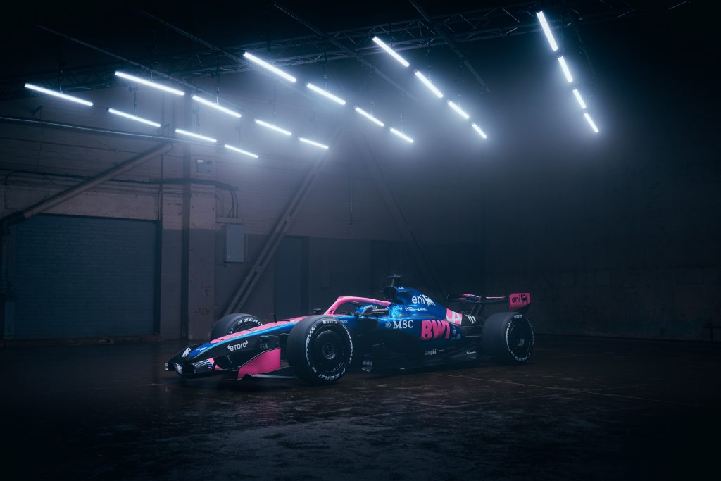
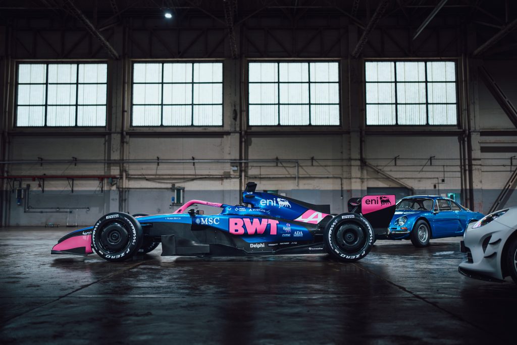
BWT Alpine livery for the 2026 F1 season. – Photo Credit: Alpine F1 Team
Alpine’s livery continues to balance two strong identities: Alpine blue and BWT pink. The challenge comes from integration. When the design unifies those colours, it looks distinctive. When the pink functions mainly as logo overlay, it reads as commercial necessity rather than a cohesive palette.
Coverage around Alpine’s recent seasons frames 2026 as a moment where the team needs clearer direction, and that context influences how fans interpret the design. A cautious livery can look sensible. It can also look like hesitation.
Atlassian Williams F1 Team
Williams presents a modern corporate identity with fewer visual distractions. Coverage describes Atlassian as the defining branding anchor, and the livery supports that by simplifying surfaces so the title partner reads clearly at speed.
This matters for Williams because it signals a psychological shift. The team no longer sells nostalgia first. It sells execution, partners, and a serious rebuild story. The cleaner the bodywork looks, the more it implies internal order.
The most effective accent comes from Duracell, whose warm copper branding adds contrast and energy while respecting the overall balance. As a result, the FW48 communicates clarity and discipline rather than spectacle, presenting Williams as a team focused on structure, partners, and long term credibility.
Aston Martin Aramco Formula One Team
Aston Martin chooses refinement and calls it strategy. The AMR26 keeps British Racing Green as the emotional anchor, then widens and strengthens the Lime Essence accent to sharpen contrast and improve shape definition along the side.
The Honda branding carries symbolic weight because it frames Aston Martin’s long term technical ambition, even before the full competitive picture becomes clear. The sponsor set also stays consistent, with Aramco remaining central and the wider partner portfolio sitting in disciplined placements that avoid clutter.
Cadillac Formula 1 Team
Cadillac’s Formula 1 debut livery delivers a deliberately restrained luxury statement, built around deep black, sharp white, and exposed carbon surfaces. The design mirrors Cadillac’s post 2021 brand reset, where minimalism and precision replaced chrome heavy excess across its road and V Series portfolios.
TWG branding anchors the sidepod visually and signals the Andretti backed structure behind the programme, while Gainbridge and Tommy Hilfiger reinforce the car’s premium American positioning rather than outright motorsport aggression.
The near total absence of colour shifts focus toward form, proportion, and surface quality, turning the car into a moving design object rather than a traditional racing billboard. As an opening statement, Cadillac chooses brand authority and confidence over spectacle, saving its performance personality for what happens on track rather than on the paint.
Featured Image Credit: McLaren Media Centre